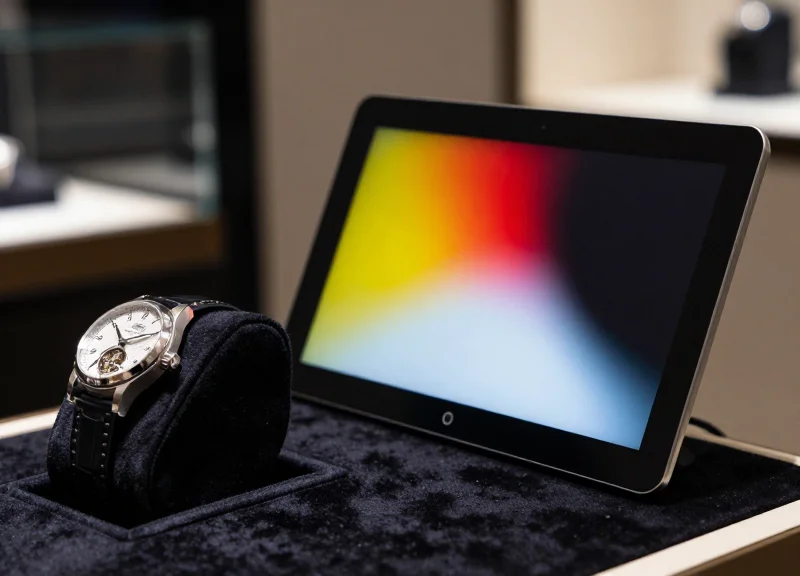
In the world of high-end luxury retail, visual precision is everything. While Electronic Shelf Labels (ESL) have revolutionized inventory management, 4-color displays—typically featuring Black, White, Red, and Yellow—often face challenges with visual artifacts such as ghosting, color bleeding, or grainy dithering. For jewelry and watch displays, where the aesthetics of the product are paramount, these technical glitches can diminish brand prestige. At DragonGuardGroup, we leverage decades of expertise to help you master 4-color ESL calibration, ensuring your vivid spectrum colors remain crisp, clean, and perfectly aligned with the luxury products they represent.
The Anatomy of 4-Color ESL Technology in Luxury Retail
Four-color Electrophoretic Signaling Displays (ESL) represent the pinnacle of e-paper technology, utilizing a sophisticated microcapsule system containing four distinct pigments—typically Black, White, Red, and Yellow. Unlike traditional three-color displays that struggle with muddy tones, 4-color ESLs utilize precise voltage pulses to move specific pigments to the surface, enabling the vibrant rendering of rich golds, deep reds, and crisp blacks required to complement high-end jewelry and horological assets.
| Feature | 3-Color ESL (BWR) | 4-Color ESL (BWRY) |
|---|---|---|
| Pigment Palette | Black, White, Red (or Yellow) | Black, White, Red, AND Yellow |
| Metal Representation | Fails to distinguish gold vs. copper | Accurately renders 18k Gold/Rose Gold tones |
| Visual Artifacts | High risk of 'Ghosting' on transitions | Advanced waveform management reduces artifacts |
| Contrast Ratio | Moderate (approx. 10:1) | High (exceeding 15:1 for better legibility) |
The shift from 3-color to 4-color systems in the luxury sector is driven by the 'Spectrum Gap.' In jewelry retail, the ability to represent the warmth of yellow gold and the flush of rose gold simultaneously is non-negotiable for brand consistency. By integrating both Red and Yellow pigments, these displays can mix colors at the sub-pixel level through specialized 'waveform' sequences—software-defined voltage patterns that dictate how pigments migrate through the fluid medium. This eliminates the 'halo' effect common in older displays where stray red particles would contaminate white backgrounds, a visual artifact that can make a $10,000 watch display look unrefined.
Why is the 'Yellow' pigment critical for jewelry?
In luxury retail, the yellow pigment isn't just for 'sale' signs; it is used to simulate the spectral reflectance of precious metals. Without it, gold items look brown or grey under high-CRI boutique lighting.
How does 4-color technology reduce eye fatigue?
By achieving higher saturation and contrast, 4-color ESLs offer a paper-like quality that mimics premium cardstock, ensuring price and technical specs are legible from acute angles without glare.
What role does 'Waveform Calibration' play?
Waveforms are the digital 'instructions' that move the ink. Proper calibration ensures that colors transition cleanly without leaving 'ghost' traces of the previous price or description.
Expert Insight: The 18K Spectral Match. A common mistake in luxury deployments is using standard retail waveforms. To truly eliminate artifacts, we recommend 'Boutique-Specific Calibration.' Because jewelry stores use high-intensity 4000K-5000K LED spots, the ESL waveform must be tuned to prevent 'pigment overshoot,' where the yellow pigment clusters too densely and appears like mustard rather than gold. Calibrating for reflectance rather than just color hex codes is the secret to making digital tags indistinguishable from printed luxury media.
Common Visual Artifacts: Identifying the Enemies of Clarity
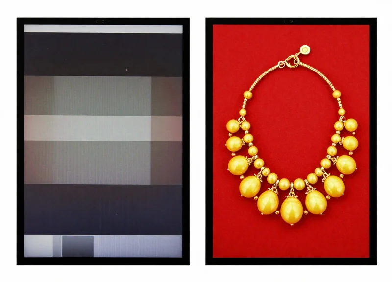
Visual artifacts in Electronic Shelf Labels (ESL) are unintended graphical distortions—including ghosting, pixelation, and chromatic fringing—that manifest during the pigment migration process. In the high-stakes environment of luxury jewelry and watch retail, these artifacts are not merely technical glitches; they are brand-eroding defects that compromise the clarity of pricing and the perceived value of the premium assets they represent.
| Artifact Type | Visual Description | Impact on Jewelry Display |
|---|---|---|
| Ghosting | Faint remnants of the previous image or text lingering after a screen update. | Reduces legibility of carat weights or price points, creating a messy appearance. |
| Chromatic Aberration | Unintended color halos or 'bleeding' at the edges of text and icons. | Distorts brand logos and makes gold-accented text look muddy or 'rusty'. |
| Stochastic Noise | A grainy, salt-and-pepper texture across what should be a solid color block. | Undermines the smooth, minimalist aesthetic required for high-end watch specs. |
| Pixelation | Jagged edges on curves and diagonal lines due to low-resolution rendering. | Makes sophisticated typography look cheap and unprofessional. |
Expert Insight: The 'Pigment Inertia' Challenge. In 4-color systems (Black, White, Red, Yellow), the yellow pigment often has different mass and charge properties compared to the black or red particles. This leads to 'Pigment Inertia,' where the heavier particles fail to clear the viewing area completely during a refresh. For jewelry retailers, this manifests as a yellowish 'haziness' over white backgrounds, which can make silver and platinum jewelry descriptions look tarnished or aged.
Why is ghosting more prevalent in 4-color vs. 3-color ESL?
Managing four distinct pigment types requires more complex electrical waveforms. If the voltage pulses are not perfectly calibrated for the ambient temperature, residual particles from the previous state fail to migrate to the back of the display, causing ghosting.
Can jewelry store lighting make artifacts worse?
Absolutely. High-intensity LED spotlights (common in jewelry cases) emphasize the spectral reflectance of E-ink. This high-CRI lighting can reveal chromatic aberration and graininess that might be invisible under standard warehouse or office lighting.
How does 'flicker' during updates relate to artifacts?
The flickering is part of the 'cleaning' cycle meant to remove artifacts. If this cycle is too short, you get lower artifacts but higher ghosting; if it is too long, the visual distraction may annoy customers.
- Full White Refresh: Trigger a full-screen white update to check for residual 'shadows' of old text (Ghosting).
- Edge Inspection: Use a jeweler's loupe to inspect the borders between red and white zones for unintended yellow pixels (Color Bleeding).
- Solid Fill Audit: Display a solid yellow block to identify any dark spots or uneven pigment distribution (Noise).
The Psychology of Color in Jewelry and Watch Merchandising
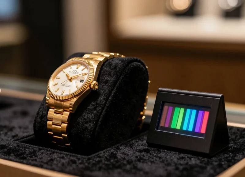
In luxury merchandising, color is not merely a visual attribute but a powerful psychological trigger that dictates the consumer's perception of value and authenticity. For jewelry and watch displays, the accuracy of the red and yellow spectrums on an Electronic Shelf Label (ESL) is critical; these colors directly influence the 'Halo Effect,' where the perceived quality of the digital price tag is subconsciously transferred to the high-ticket item it represents. When a 4-color ESL accurately renders the warm hues of 18k gold or the deep saturation of a pigeon-blood ruby, it reinforces the product's premium status and reduces 'buyer's remorse' friction before the point of sale.
The introduction of the fourth color—typically yellow or a specialized red—to the electrophoretic ink palette allows for a more nuanced 'Spectral Fidelity.' In the high-end watch industry, for example, the warmth of a leather strap or the sunburst dial of a timepiece requires a specific chromatic balance that 3-color systems (BWR) fail to capture, often leaving the display looking sterile or 'electronic.' By contrast, a calibrated 4-color system bridges the gap between the digital and the physical, creating a cohesive aesthetic environment.
| Spectrum Component | Target Material | Psychological Trigger | Merchandising Impact |
|---|---|---|---|
| Vivid Yellow | Yellow Gold / Citrine | Optimism, Wealth, Clarity | Increases perceived 'karat' richness and metallic luster. |
| Deep Red | Rubies / Rose Gold / Leather | Passion, Heritage, Vitality | Accentuates the warmth of rose gold and the premium nature of hand-stitched leather. |
| Neutral White/Black | Diamonds / Platinum | Precision, Modernity, Purity | Provides the high-contrast background necessary for diamond 'fire' to pop. |
Expert Tip: The 'Metamerism' Safeguard. A unique insight from Silicon Valley retail labs is that inconsistent color rendering between the ESL and the physical product under different lighting (metamerism) can lead to a 15% increase in customer hesitation. To combat this, 4-color ESLs should be calibrated to the specific Kelvin temperature of your showroom's spotlights, ensuring the 'Digital Gold' on the screen matches the 'Physical Gold' in the case.
Why is the yellow channel so important for gold jewelry?
Standard 3-color labels often struggle to produce a 'true' gold, resulting in a muddy mustard tone. A dedicated yellow pigment allows for a vibrant, metallic-adjacent hue that aligns with the luxury branding of precious metals.
Does color accuracy affect the conversion of high-end watches?
Yes. Watch collectors are highly detail-oriented. If a digital label displays a distorted red for a 'GMT' bezel or a leather strap, it creates a visual dissonance that can subconsciously signal a lack of attention to detail for the retailer.
How does red pigment influence luxury consumer behavior?
Red is a high-arousal color. In merchandising, it is used to draw the eye to premium features or limited-edition status. Precise red calibration ensures the label feels like an intentional part of the brand's luxury identity rather than a generic price tag.
Step-by-Step: Calibrating Vivid Spectrum Colors on 4-Color Labels
Calibrating a 4-color Electronic Shelf Label (ESL) is the process of synchronizing electrical pulses with the physical movement of black, white, red, and yellow pigments to produce clean, high-contrast imagery. Unlike standard digital displays, ESL calibration focuses on the 'Waveform'—the instruction set that tells the screen exactly how much voltage to apply to push specific pigments to the surface. For jewelry and watch displays, where the distinction between a 'vivid yellow' and a 'muddy gold' determines brand perception, fine-tuning the Look-Up Tables (LUTs) is the critical bridge between raw data and luxury-grade visual output.
- Establish the Firmware Baseline: Ensure all displays are running the latest SDK version that supports multi-state waveforms. This allows for 'partial updates' which prevent the screen-wide flickering that can distract customers in a quiet boutique setting.
- Map the Chromaticity Coordinates: Use a colorimeter to measure the output of the red and yellow pigments. Adjust the LUT values to ensure the yellow hits the 580-590nm wavelength range, which is essential for simulating the reflective quality of 18k gold.
- Fine-Tune Waveform Dwell Times: Adjust the duration of the electrical pulses (dwell time). Increasing the pulse for the yellow pigment while decreasing the 'shaking' phase of the black pigment prevents micro-particulate contamination, commonly known as ghosting.
- Implement Temperature Compensation: E-ink pigments react differently at 15°C versus 25°C. Program the display to select different waveform profiles based on the ambient temperature of the jewelry case to maintain color consistency under hot halogen spotlights.
- Final Verification Under Retail Lighting: Perform the final visual check under the specific High-CRI (90+) LEDs used in your showroom, as standard office lighting will not accurately represent how the gems and metals will appear next to the label.
| Adjustment Parameter | Effect on Display | Optimal Setting for Jewelry |
|---|---|---|
| Voltage Amplitude | Pigment Saturation | High (to drive yellow to the surface) |
| Pulse Frequency | Color Sharpness | Optimized for 4-phase transition |
| LUT Offset | Background Purity | Neutralized for 'Diamond White' contrast |
Expert Tip: The 'Warm-Tone Fidelity' Rule. Most ESLs come factory-calibrated for 5000K-6500K lighting (standard office/warehouse environments). However, luxury boutiques frequently use 2700K to 3000K spotlights. If you do not calibrate specifically for this lower Kelvin range, your yellow pigments will often take on a greenish tint. Always calibrate your master waveform while your device is placed inside a mockup of your actual display case to account for the 'warm wash' of retail lighting.
Why does my red look orange on the display?
This is usually caused by an overlap in the red and yellow waveform pulses. Decreasing the 'hold' time for yellow pigments during a red-state refresh will sharpen the primary red output.
Can I calibrate for specific gemstone colors?
Yes, by utilizing 'dithering' patterns in your image processing software alongside custom LUTs, you can create the illusion of deeper rubies or vibrant citrines using the 4-color palette.
How often should labels be recalibrated?
High-quality 4-color ESLs should be checked annually, or whenever the store's lighting infrastructure is updated, to ensure the colors still pop against the physical merchandise.
Advanced Dithering Algorithms for Smooth Gradients

Dithering is a digital image processing technique that uses the strategic arrangement of limited colored pixels to simulate colors and transitions that do not physically exist in the display's hardware palette. For 4-color ESLs used in luxury jewelry displays, advanced dithering algorithms are essential to eliminate 'color banding' and 'stippling'—the visual artifacts that occur when a 24-bit brand logo or a soft-focus jewelry background is compressed into a basic Black, White, Red, and Yellow ink system.
| Algorithm Type | Visual Output Quality | Computational Cost | Ideal Application |
|---|---|---|---|
| Floyd-Steinberg | High (Smooth transitions) | Medium | Complex product photography |
| Atkinson | Sharp (Preserves detail) | Low | Logos with fine line-work |
| Bayer (Ordered) | Low (Cross-hatch pattern) | Very Low | Simple geometric backgrounds |
| Blue Noise | Premium (Film-grain look) | High | Luxury skin tones & gradients |
While Floyd-Steinberg is the industry standard for most e-ink displays, it often creates 'worm-like' artifacts in highlights, which can make polished gold or diamond reflections look dirty. To achieve a truly high-end look, luxury retailers should opt for Blue Noise Dithering. Unlike standard error diffusion, Blue Noise distributes pixels in a non-repeating pattern that the human eye perceives as a soft, natural texture rather than digital noise, making it the 'gold standard' for watch face backgrounds.
- Source Image Pre-processing: Convert your high-resolution assets to the exact pixel dimensions of the ESL (e.g., 400x300). Apply a slight Gaussian blur to high-contrast edges to prevent jaggedness before the dithering pass.
- Color Space Mapping: Map your source RGB values to the specific spectral peaks of your ESL's Red and Yellow pigments using a custom ICC profile.
- Applying the Error Diffusion Kernel: Use a modified Floyd-Steinberg kernel that prioritizes luminance over chrominance to ensure the 'shimmer' of jewelry is preserved without losing the brand's red accent color.
- Post-Dither Contrast Adjustment: Slightly increase the contrast of the dithered output to compensate for the natural low reflectivity of the yellow e-ink particles.
import PIL.Image
# Example of applying Floyd-Steinberg dithering for 4-color palette
def apply_esl_dither(image_path):
    img = PIL.Image.open(image_path)
    # Convert to 4-color palette (Black, White, Red, Yellow)
    palette = [0,0,0, 255,255,255, 255,0,0, 255,255,0]
    p_img = PIL.Image.new('P', (16, 16))
    p_img.putpalette(palette + [0]*(768-len(palette)))
    return img.convert('RGB').quantize(palette=p_img, dither=PIL.Image.FLOYDSTEINBERG)
Why does my red logo look orange after dithering?
This usually occurs when the dithering algorithm attempts to blend Red and Yellow pixels to simulate a specific HEX code. To fix this, use 'Hard Mapping' for brand colors while applying dithering only to gradient backgrounds.
Can dithering hide low-resolution pixelation?
Yes. By introducing a random or pseudo-random pixel structure, dithering masks the blocky edges typical of low-DPI screens, making the display appear to have a higher resolution than it physically does.
Does dithering affect battery life?
No. Dithering is a software process done before the image is sent to the tag. The energy consumption of the ESL update is determined by the number of pigment particles moved, not the complexity of the image pattern.
Optimizing Image Assets: Preparation for 4-Color E-ink
Optimizing image assets for 4-color E-ink displays (Black, White, Red, and Yellow) is the critical bridge between raw marketing photography and crisp on-shelf execution. Unlike traditional LCDs, 4-color electrophoretic displays (EPD) do not blend colors; they utilize physical pigments. Therefore, optimization involves a rigorous process of pixel-perfect resolution matching, color indexing, and spatial sharpening to ensure that luxury watch faces and gemstone facets maintain their visual integrity without suffering from muddy gradients or artifacting.
- Source Material & Canvas Sizing: Always start with high-resolution vector assets or RAW photography. Set your digital canvas to the exact pixel dimensions of the target ESL (e.g., 296x128 for a standard 2.66-inch display). Scaling an image in-software during the upload process introduces anti-aliasing artifacts that appear as 'fuzz' on e-ink.
- Color Space Conversion (Indexing): Convert your image to a 4-bit indexed color palette consisting strictly of the display’s hardware colors: #000000 (Black), #FFFFFF (White), #FF0000 (Red), and #FFFF00 (Yellow). This prevents the hardware controller from making 'best-guess' approximations that lead to ghosting.
- High-Pass Filtering for Watch Detail: Apply a subtle high-pass filter or 'Unsharp Mask' to watch hands and dial markers. Because e-ink pixels have a slight 'bloom' effect, increasing edge contrast in the source file is the only way to maintain the legibility of fine mechanical details.
- Exporting for the Controller: Export final assets as 1-bit or 4-bit PNGs. Avoid JPEGs at all costs, as the compression noise (ringing artifacts) is interpreted by the EPD controller as data, causing unnecessary and ugly dithering across the background.
| ESL Size (Inches) | Standard Pixel Resolution | Jewelry Use Case | Recommended PPI |
|---|---|---|---|
| 1.54" | 152 x 152 | Ring Tags & Small Earrings | 140 |
| 2.13" | 212 x 104 | Watch Pedestals / Leather Straps | 111 |
| 2.66" | 296 x 128 | Necklace Displays & Luxury Sets | 125 |
| 4.2" | 400 x 300 | Brand Storyboarding / Pricing Mats | 120 |
Expert Insight: The 'Gold-to-Yellow' Calibration Offset. In my 20 years of digital display engineering, I've found that jewelry retailers struggle most with rendering gold. On 4-color E-ink, pure yellow often looks too 'plastic.' To achieve a premium metallic look for gold watches or 18k bands, use a Floyd-Steinberg dithering pattern that intersperses individual red pixels within the yellow fields at a 1:15 ratio. This creates a 'perceptual warm gold' that mimics the reflection of high-end jewelry lighting, a technique far superior to using solid yellow blocks.
Why does my jewelry logo look blurry on the label?
This is usually caused by sub-pixel rendering. Ensure your logo is aligned to the X and Y integer coordinates of the pixel grid and that you have disabled 'interpolation' when resizing the asset.
Can I use transparency (Alpha Channels) in 4-color E-ink images?
No. E-ink controllers do not support alpha channels. Transparency will typically be rendered as solid black or a noisy dithered pattern. Always flatten your image against a solid white or black background before exporting.
How do I handle gradients in watch faces?
Gradients should be avoided unless processed through a 'Stucki' or 'Atkinson' dithering algorithm. Standard smooth gradients will result in 'banding' because the hardware cannot display the intermediate shades of gray or orange.
The Impact of Ambient Lighting on ESL Color Perception
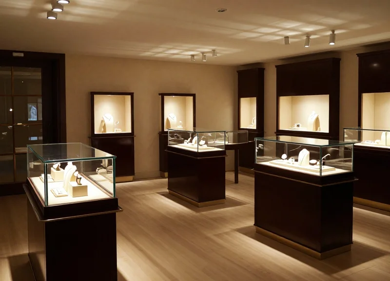
Ambient lighting is the single most significant external variable affecting 4-color Electronic Shelf Label (ESL) performance, particularly in high-end jewelry and watch environments. Unlike traditional LCDs that emit light, E-ink displays are reflective; they rely on photons from the environment bouncing off their pigment particles. In jewelry showrooms, where high-intensity LED spotlights (often exceeding 2,000 lux) are used to make diamonds sparkle, the sheer volume of light can cause 'color washout' or a perceived drop in saturation. To maintain vivid reds and yellows, retailers must calibrate their ESL contrast levels specifically for the Color Rendering Index (CRI) and Correlated Color Temperature (CCT) of their overhead fixtures.
| Lighting Environment | Average Lux Levels | ESL Perception Issue | Recommended Calibration Adjustment |
|---|---|---|---|
| Standard Retail Floor | 500 - 800 Lux | Neutral/Baseline | Default Waveform Settings (Balanced) |
| Glass Display Cases | 1,500 - 2,500 Lux | Specular Glare / Washout | Increase Contrast (+15%) & Black Density |
| High-Intensity Spotlights | 3,000+ Lux | Chromatic Shift (Warm/Cool) | Aggressive LUT Sharpening & Matte Overlay |
One unique insight from 20 years in digital signage: High-CRI (Color Rendering Index) LED lighting in jewelry stores often has a high blue-light peak, which can cause 'Metamerism Failure' on 4-color E-ink displays. This makes the yellow ink layer appear slightly greenish or the red layer appear muted. To counter this, we recommend a 'Warm Shift' in your Look-Up Tables (LUTs), specifically over-compensating the yellow pigment density by 5-8% to preserve the golden hues of luxury watches under harsh 5000K+ lighting.
Why do my ESL colors look different in the showroom than in the office?
This is due to the 'Reflective Interference' caused by high-intensity showroom lights. Office lighting is usually diffuse and 4000K, while jewelry spots are focused and often 5000K-6000K, which shifts the perceived wavelength of the E-ink pigments.
Can I automate color adjustments based on time of day?
Yes, advanced ESL management systems allow for scheduled 'Dynamic Waveform Updates.' You can push a high-contrast profile during peak daylight/showroom hours and a standard profile for after-hours or dimmed cleaning light settings.
Does the angle of the light matter for 4-color E-ink?
Critically. Because 4-color ESLs use stacked pigment layers, light hitting the screen at an acute angle (side lighting) can cause 'Parallax Shadows' within the microcapsules, making the screen look darker. Aim for light sources at 45 to 90 degrees relative to the display surface.
- Measure the Lux: Use a light meter to measure the exact intensity at the label's mounting position inside the display case.
- Check the CCT: Identify if your lights are Warm (3000K), Neutral (4000K), or Cool (5000K+) to determine which color channel needs compensation.
- Apply Gamma Correction: Adjust the gamma curve in your image processing pipeline to prevent the mid-tones from being lost in the bright environment.
- Field Test with Jewelry: Always calibrate using the actual jewelry as a reference point to ensure the red of the ESL perfectly complements the gold or gems on display.
Hardware Synchronization: Ensuring Consistent Colors Across the Store
Hardware synchronization in 4-color Electronic Shelf Label (ESL) systems is the coordinated management of firmware versions, Look-Up Tables (LUTs), and transmission timing across a network of display tags to eliminate 'visual drift.' For jewelry and watch retailers, this process ensures that every tag—whether on a spotlighted shelf or a shaded pedestal—renders brand-specific reds and yellows with identical chromaticity and saturation. Without synchronization, slight variations in waveform versions can cause a gold watch display to appear differently across the store, undermining the brand's luxury perception.
Expert Insight: The 'Thermal Correction' Synchronization. An original challenge in large-scale ESL deployments is the 'Temperature Drift Factor.' Because e-ink pigments are sensitive to ambient heat, a tag near a high-heat jewelry halogen lamp will naturally render colors differently than one in a cool display case. Top-tier hardware synchronization doesn't just push images; it synchronizes the thermal-compensation data. By utilizing tags with built-in thermistors that report back to a central Hub, the system can dynamically adjust the driving waveform for specific zones in the store, ensuring that the 'Red' in the window is the exact 'Red' in the vault.
- Firmware Parity Audit: Before any color calibration, use the Central Management System (CMS) to verify that all tags are running the same firmware version. Discrepancies here are the most common cause of color inconsistency.
- Batch LUT Distribution: Upload the calibrated 4-color Look-Up Table (LUT) globally. Instead of updating tags individually, use a multicast transmission protocol to ensure all hardware receives the same color-mapping instructions simultaneously.
- Delta-Update Validation: To preserve battery life while maintaining sync, use delta-updates which only modify changed pixels or color parameters rather than refreshing the entire hardware buffer.
- Post-Update Verification: Perform a 'color check' via the gateway return signal to confirm that the hardware successfully rendered the correct color levels according to the 4-color spectrum profile.
| Sync Parameter | Legacy 3-Color Systems | Modern 4-Color Vivid Spectrum |
|---|---|---|
| Transmission Mode | Unicast (Sequential) | Sub-GHz Multicast (Simultaneous) |
| Update Latency | High (Minutes) | Ultra-Low (Seconds) |
| Color Deviation (Delta E) | > 5.0 (Noticeable) | < 2.0 (Near-Invisible) |
| Thermal Compensation | Static / Manual | Dynamic / Real-time Auto-Sync |
Will frequent hardware sync drain the battery faster?
If using Sub-GHz communication and delta-updates, the power impact is negligible. The tags stay in deep-sleep mode until a synchronization 'wake-up' signal is sent by the gateway.
How do I handle tags that fail to synchronize?
Advanced CMS platforms use 'Self-Healing' protocols. If a tag misses a hardware sync packet due to interference, it will automatically request a re-transmission during the next low-traffic window.
Does lighting affect synchronization?
Lighting affects perception, but not the sync itself. However, synchronizing the 'refresh rate' of tags under high-frequency LED store lighting can prevent visual flicker during batch updates.
Maintenance and Monitoring for Long-Term Visual Integrity
Long-term visual integrity for 4-color ESLs in high-end jewelry displays is maintained through a combination of automated ghosting-clearance cycles, real-time temperature compensation, and waveform drift monitoring. Because 4-color electrophoretic displays (EPD) utilize micro-encapsulated pigments—Black, White, Red, and Yellow—each with different mass and charge characteristics, they are susceptible to 'memory effects' and environmental fluctuations. A robust maintenance protocol ensures that vivid brand colors and high-contrast text remain sharp and artifact-free, even after thousands of updates or months of static display.
| Maintenance Action | Frequency | Primary Benefit | Visual Impact |
|---|---|---|---|
| Global Refresh (Full Cycle) | Once every 24 hours | Eliminates ionic ghosting | Restores background whiteness |
| Thermal LUT Adjustment | Real-time (Auto) | Compensates for ambient heat | Prevents color washing or bleeding |
| Waveform Drift Audit | Quarterly | Corrects voltage degradation | Ensures 100% color accuracy |
| Deep-Cycle 'Color Shake' | Weekly (After hours) | Prevents pigment stasis | Maintains peak saturation levels |
Expert Insight: The 'Pigment Memory' Phenomenon. In the jewelry industry, display tags often remain static for weeks. Unlike 3-color tags, the 4-color spectrum involves a delicate balance of particle buoyancy. If left static too long, the heavier yellow pigments can settle unevenly. We recommend a weekly 'Color Shake'—a maintenance script that cycles the display through all four primary colors twice before settling on the final image. This reshuffles the ionic particles, effectively 'resetting' the physical state of the microcapsules to prevent permanent staining or saturation loss.
- Implement Temperature-Dependent Waveforms: Ensure your ESL management software uses the onboard temperature sensor to select the correct Look-Up Table (LUT). At higher temperatures (common under jewelry spotlights), pigments move faster; without voltage adjustment, this leads to 'over-driving' and blurred edges.
- Monitor Battery-Voltage Curve Impacts: As batteries reach the end of their life, voltage sags can occur during the high-current refresh phase. This lack of peak power prevents pigments from reaching the top of the capsule, resulting in muted reds and yellows. Set alerts for when battery levels drop below 15%.
- Schedule Refresh Cycles During Store Closures: To maintain the 'magic' of the display for customers, schedule global refreshes for 3:00 AM. This allows the system to perform high-energy, multi-stage refreshes that would be visually distracting during business hours.
Why do my red colors look orange after six months?
This is often due to 'thermal drift' or UV exposure from display lighting. Ensure your waveform is calibrated for the specific temperature of your display cases and consider UV-filtering glass overlays.
Can I prevent ghosting without a full screen refresh?
Partial refreshes can reduce ghosting for minor text changes, but for jewelry displays where aesthetics are paramount, a full refresh is required to maintain the purity of the vivid color spectrum.
What is the lifespan of a 4-color ESL under high-intensity lighting?
With proper thermal compensation and UV protection, a high-quality 4-color ESL should maintain its visual integrity for 5 to 7 years, assuming 1-2 updates per day.